ToA Forums

New ToA emblem

« Older   Newer »
  Share  
Flans are delicious
view post Posted on 18/1/2011, 20:21


I called it emblem but its really more like a crest than anything else...

Anywho tell me your opinions and suggestions.

image

Colours are pickable~

The top seems a bit empty... but i couldn't think of adding anything without overdoing it...

Edited by Flans are delicious - 20/1/2011, 19:36
 
Top
LittleMissMisty
view post Posted on 19/1/2011, 13:26


It's very detailed =o
Imagine trying to sew that onto our capes! xD

It looks nice~! The colour looks suitable as well.
The only thing I'm not sitting well with is the checked pattern. Seems out of place is all.

Nice job! ^^
 
Top
Flans are delicious
view post Posted on 20/1/2011, 19:44


There i took the chekers out, I like them, but you're right, they're outta place!

The colours are still pickable tho.. i picked blue over green and red cause... Green would make it look slugish/snake-ish! (ICK!) and the red would make it look vayne-kinda evil~ (ICK!) So i just when with blue..i guess we can pick the colours later when we have more members.

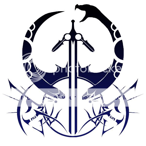
Oh i should also clear something up... I put ouroboros there for a reason, T.O.A. in itself is kinda hard to put on a symbol/logo, since there's nothing really defining it but the people in it, But Shin once said that T.O.A. Sounded like "Touwa" or "towa" or wahtever, wich , I'm pretty sure, meant "forever" or "eternity" or whatever, since then i'll always gave that sorta meaning to ToA, therefor the reason why Ouroboros is there, wich is a sign of imortality/eternity or just infinite loops, (besides it give us a scary-evil look ,right? kekeke) anywho, I'm just saying this cause i wanted to explain that Ouroboros being there has nothing to do with my IGN in Pandora Saga (wich is Ouroboros) I mean it sorta has, but that's because i picked that IGN because i intend to be the T.O.A. leader in there and therefor all the Ouroboros/ToA meaning would be exemplified , am i being too confusing? I just wanted you to know it's not some sort of main character-syndrome or something, i'm thinking of making a new character so people won't think the Crest is just me being an attetion seeker...
 
Top
LittleMissMisty
view post Posted on 21/1/2011, 07:03


I can't tell the difference...


KIDDING =P

I'm liking this version more, the detail looks more balanced and flows. *thumbs up*
It kinda did remind me of the emblem of the house solidor thing... Maybe it's cause of the snake... Everytime I look at it, I think of Vayne. Oh no wait, actually it reminds me of that thing from FFXIII... the funny shaped building or w/e... I forgot.

Either way, it's looking good. I can't seem to put one word to it, which is good because we want variation right?

Nice work ^^
 
Top
Flans are delicious
view post Posted on 23/1/2011, 13:57


Thanks a bunch mimi~!

image

You're right ! it does looks a bit alike... even tho i didn't remember the house solidor's emblem to be this way... Our crest was much more inspired in Blazblue crests kekeke, hazama's in particular.
 
Top
JSong
view post Posted on 26/1/2011, 00:21


Pretty cool ToA symbol, and I agree, it is very detailed :O! But that's what makes it awesome xD.

Do the markings you added represent anything? Or just random stuff to make it look cool? Besides the snake I mean, as you already described that.

Nice job ^^
 
Top
LittleMissMisty
view post Posted on 28/1/2011, 13:03


Now I'm being reminded of the crest/symbols from FFXIII... Ah >_<'

How much space are we even allowed to draw on for the guild flag/logo things? Cause you might have to simplify it if the detail ends up getting pixelated =o
 
Top
Flans are delicious
view post Posted on 29/1/2011, 13:40


I don't really know i guess it kinda depends on the game...
Oh it also reminds me of the Esper's crests in Final fantasy XII!
 
Top
7 replies since 18/1/2011, 20:21   469 views
  Share